
Client Overview
Vriksh is a luxury lifestyle brand with offerings across clothing, accessories, leisure travel, and hospitality. Rooted in the Sanskrit word for “tree,” Vriksh symbolizes growth, stability, and shelter—core values that define its brand essence. With an ambition to blend tradition with modern sophistication, Vriksh is poised to redefine elegance across experiences.
The Challenge – Evolving with Vision
1. The old logo lacked the elegance and premium feel expected from a luxury brand.
2. It did not reflect the multi-vertical nature of the business.
3. The tree symbolism wasn’t visually communicated, creating a disconnect from the name “Vriksh.”
Vriksh needed a refined identity that echoed luxury, versatility, and meaning—across fashion and lifestyle touchpoints.
Research and Discovery
We explored:
1. Global luxury branding styles—from serif typography to minimalist icons.
2. Symbolism of trees: strength, rootedness, natural elegance.
3. Competitor aesthetics in fashion and hospitality to position Vriksh distinctively.
Design Process – From Roots to Refinement
1. We began with sketch explorations of symbolic trees, luxury monograms, and modern serif logotypes.
2. Created a modular logo system—with both primary (full) and secondary (symbol-only) variations.
3. Incorporated visual cues of branches, growth rings, and organic forms within a clean, structured layout.
4. Selected a luxury serif font with refined curves and spacing for a timeless feel.
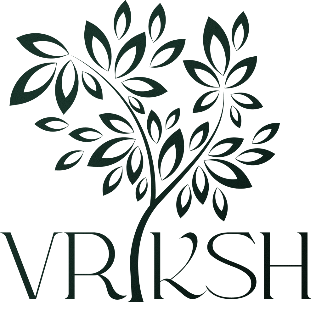
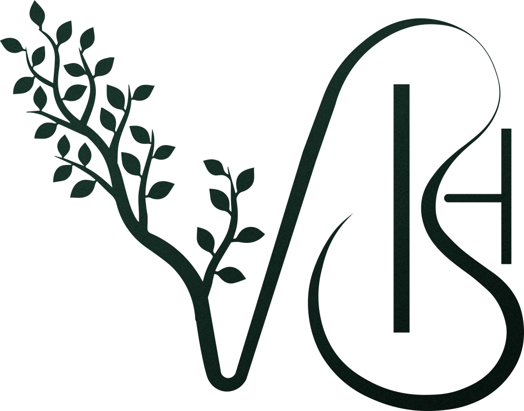
Before vs After – The Transformation
Before
1. Generic and minimal identity
2. Weak brand recognition
3. No reflection of premium values
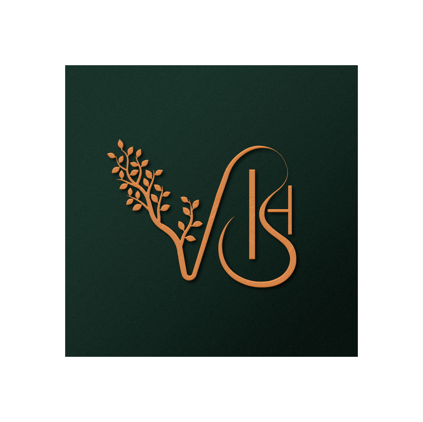
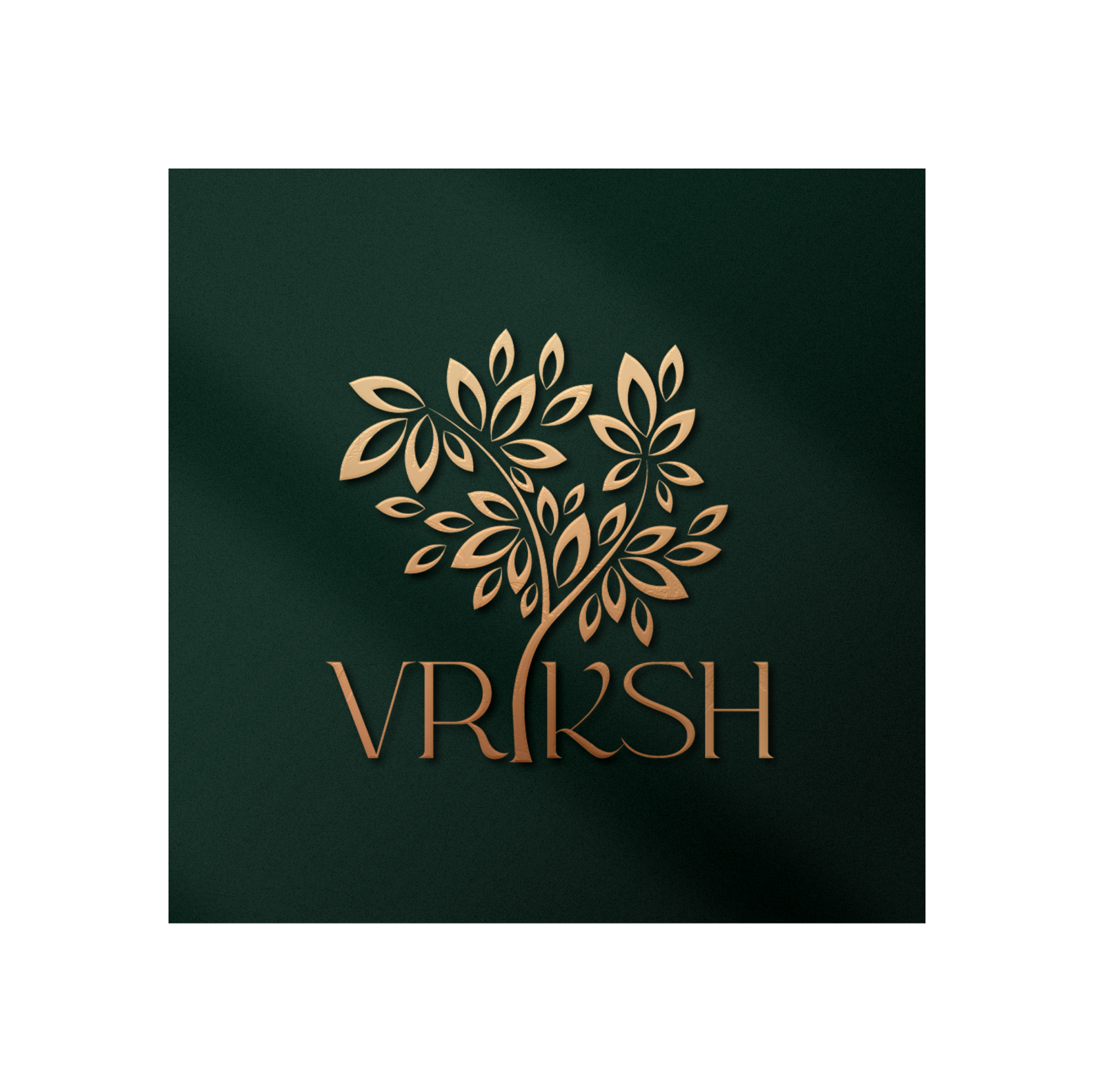
After
1. A sophisticated logo combining typography and symbolism
2. Refined tree emblem representing growth and legacy
Conclusion
At HappyPari Designs, we don’t just redesign logos—we redefine stories. With Vriksh, we helped plant the seeds of a timeless
