- Case Study: CyberUltron – ZAPISECPitch Deck Presentation Design
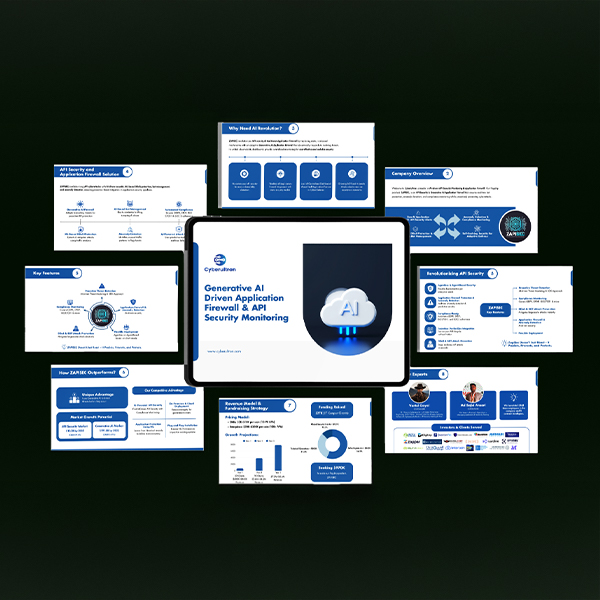 Introduction CyberUltron is a cybersecurity-focused company offering cutting-edge solutions with a strong emphasis on Generative AI. Their flagship product, ZapiSec, is a proactive and compliance-ready API security platform designed to detect and mitigate threats in real-time. It combines ML, LLM… Read more: Case Study: CyberUltron – ZAPISECPitch Deck Presentation Design
 - Case Study: Logo Transformation for Vriksh
 Client Overview Vriksh is a luxury lifestyle brand with offerings across clothing, accessories, leisure travel, and hospitality. Rooted in the Sanskrit word for “tree,” Vriksh symbolizes growth, stability, and shelter—core values that define its brand essence. With an ambition to… Read more: Case Study: Logo Transformation for Vriksh
 - Case Study: SelectView Website Redesign
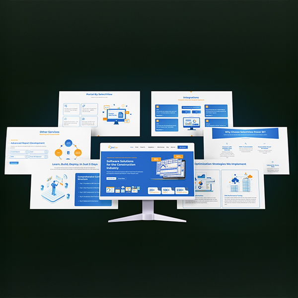 About SelectView SelectView is a leading software provider for the construction industry, helping companies streamline operations with intelligent, connected data solutions. Their tools bridge the gap between field and office—empowering project teams to make smarter, faster decisions. However, their digital… Read more: Case Study: SelectView Website Redesign